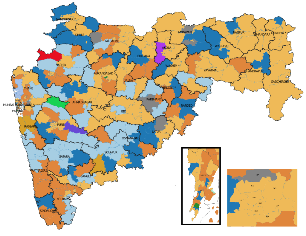
The true political map of Maharashtra
Maharashtra is the state of India with economy comparable to Norway, and population comparable to 4 Australias. With highest GDP in India(14% of total), and the financial capital Mumbai at stake its also politically very important state. Maharashtra Legislative Assembly has 288 seats. There are multiple ways of showing which political party has influence in which area. Most of the news channels and analysts use the simple method of chlorepleth. In a chlorepleth the geographical area of a constituency is highlighted in a colour representing the party which won there. This gives us a maps which are like this.

But there is a serious flaw in this representation. Being area dependant visualization, it emphasizes constituencies with large areas and reduces the impact of small constituencies. As a result the urban areas (like Mumbai/Pune) are represented by a small blot whereas sparsely populated constituencies like Chandrapur will take up large area. As a matter of fact, a single Gadchiroli constituency occupies more space than the constituencies in urban areas like Mumbai, Thane, Nagpur, Pune taken together (92 constituencies).
Therefore, at first glance, it is easy to underestimate the 122+63=186 out of 288 number of seats (65%) that BJP and Shivsena hold together. Also, it is likely to give an impression that the Eastern Maharashtra i.e. Vidarbha has carried BJP to a win. But that would be wrong. Actually it is the urban areas that have given huge boost to BJP.
The normal remedy to this problem has been to give a blowout of Urban Areas on side. The problem specific to Maharashtra is that there are multiple urban centres with 4+ constituencies. Giving more than 2 blowouts actually defeats the purpose.
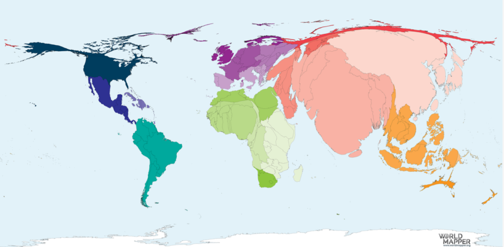
So, our research team in Proneta tried a few different combinations to visualize all the 288 constituencies, so as to give every one of them equal importance in a map. The first and obvious set of ideas was developing a cartogram. A cartogram is a map that changes the shape of a geographical feature in proportion with a certain parameter. This idea was recently made popular with Peter’s Projection and “the true size of” site which lets us compare land sizes of countries – https://thetruesize.com and Worldmapper.org which shares cartograms for the world map. Here is the map where all countries are sized by their Population.
So, we thought let’s get a cartogram of Maharashtra where each constituency is sized equally. The programs to create cartograms keep the shape of the constituency similar and change the size. So, programmatically we got this result.
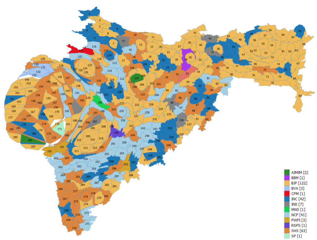
This Map actually gives a better representation of the relative importance of constituencies and of their relative location. It also shows the impact that Mumbai, Pune and Nagpur city had on the BJP-Shivsena’s lead. A slight problem is it distorts the geographic boundaries and may not be aesthetically appealing. The sizes of constituencies are not exactly equal, but they are comparable.
We also tried the taking centroids of the areas of the cartogram. It can be useful to show the vote share of a party at various places.

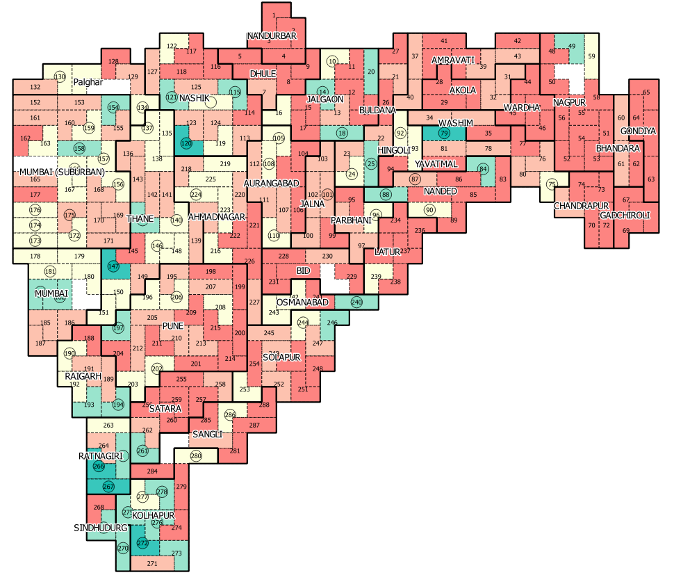
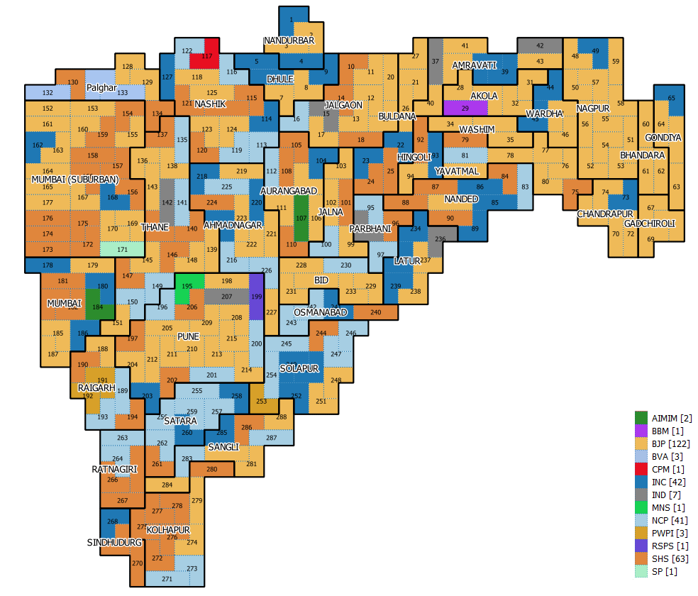
But then we decided to go fully abstract. Just like the heart symbol that shows the very complicated organ in our body, we decided to represent each constituency with three squares only. We put constituencies that are near each other like Lego blocks and with a lot of hacking and tinkering, we had the first ever, methodical cartogram of Maharahstra’s Assembly Constituencies. This Cartogram has equal sizes for all constituencies, most of the adjacency of the places is maintained and there are no weirdly extruded shapes (a sign of gerrymandering, but more on that in another post). What’s more it works excellently both for categorical indicators like Winning Party as well as for numerical variable like vote share.
Here is the maps which shows which party won-
Here is one showing the vote share of Shivsena. In the constituencies where it won, the constituency numbers are rounded.
We have started rolling out the maps in our analysis for news and political consultants. Let us know your thoughts about how these four methods of visualization reveal or ignore important information.
The possibilities of displaying various types of information in an engaging way always excites us here at Proneta. The geographical maps are just a part of what we do to analyse and make sense of information and gain valuable, actionable insights. The data used in this visuals relates to elections, but the techniques used are equally useful for business, government and humanitarian purposes. Give us a call to see how our work can help you make sense of your data, tell a better story with it and make decisions that are backed by robust analysis.